Colorful Cabinet Handles: What a Bioresin Material Changes
There was a long stretch in interior design when color receded from furniture. White, light gray, and natural wood held the field for decades, until a movement like the Memphis Group reminded us, in 1980s Milan, that a piece of furniture could also be a bold graphic statement. That boldness shows up more rarely today on a whole sofa or an entire cabinet front, more often on a detail: the handle, the knob, the fitting you can change without rethinking everything.
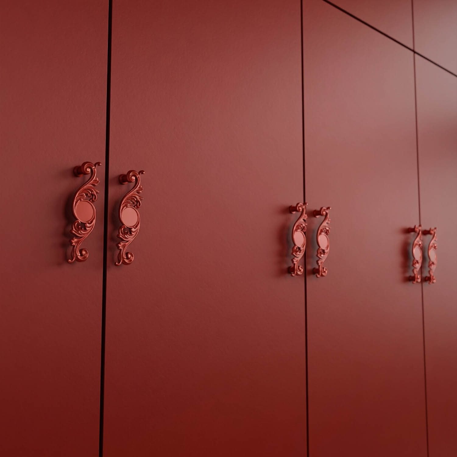
At Holdon Paris, this color almost always comes through a single material: bioresin. Unlike a metal that takes its tint on the surface (patina, lacquer, plating), bioresin is colored through and through, and its slightly pearled surface catches the light differently depending on the angle. A red, a blue, or a green gains a depth that a flat pigment never achieves. Here is what this material allows, what limits it imposes, and how to get the best out of it.
A Material Designed to Carry Color
Bioresin comes from renewable plant-based resources. It has two qualities that register immediately, to the touch and to the eye: it is light, and its surface subtly shifts in tone depending on angle and light, a pearled effect no flat paint can reproduce. It is a material suited to living spaces, bedroom, closet, living room, dresser, where the detail is looked at rather than handled non-stop.
It is not recommended, however, for kitchens, bathrooms, outdoor use, or a heavily loaded drawer: more delicate than a metal or a lacquer, it calls for decorative rather than intensive use. For those settings, bronze, brass, or aluminum take over, with a color that shifts in nature (patina, satin) but far greater resistance to moisture and impact.
A Complete Chromatic Language
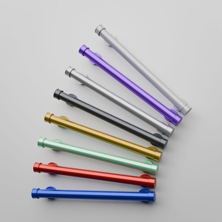
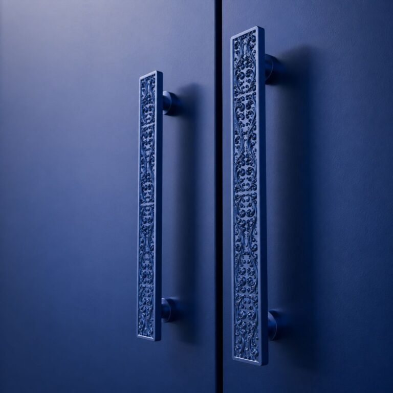
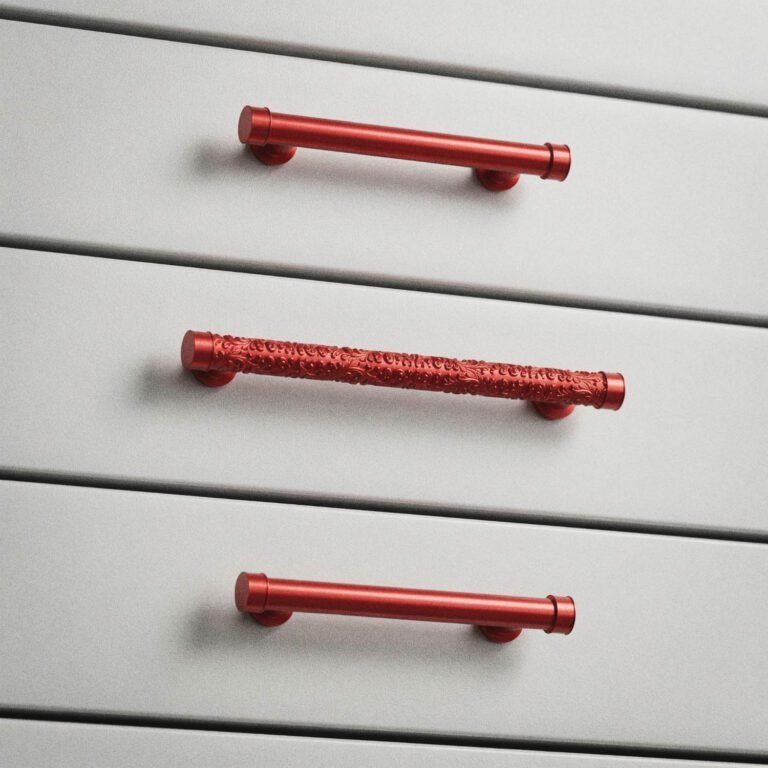
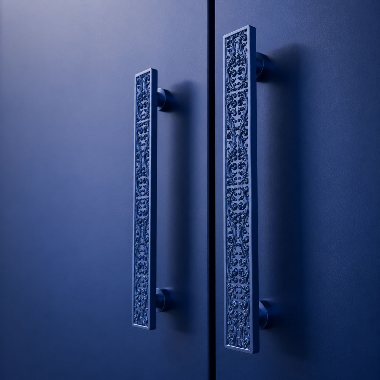
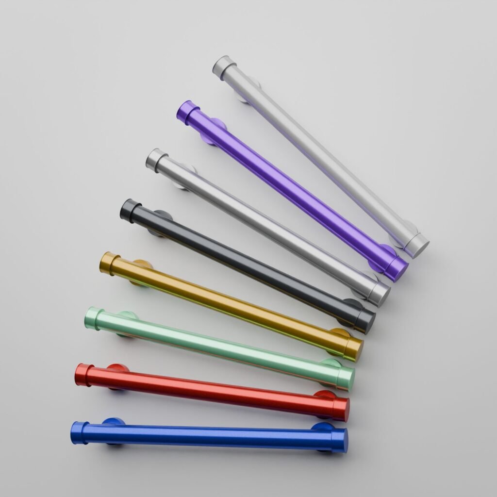
Across a single silhouette, bioresin opens up a palette that few materials in the catalog can match. White, with White Snow, remains the most discreet choice: a sculptural white with pearled highlights, working tone on tone against a light front or in sharp contrast against black. Candy Red, by contrast, goes for statement, a deep, almost lacquered red that prefers a neutral or dark front so it can stand without competition. Electric Blue works on the same single-accent principle, its intensity softening slightly against a midnight blue front in a tonal pairing.
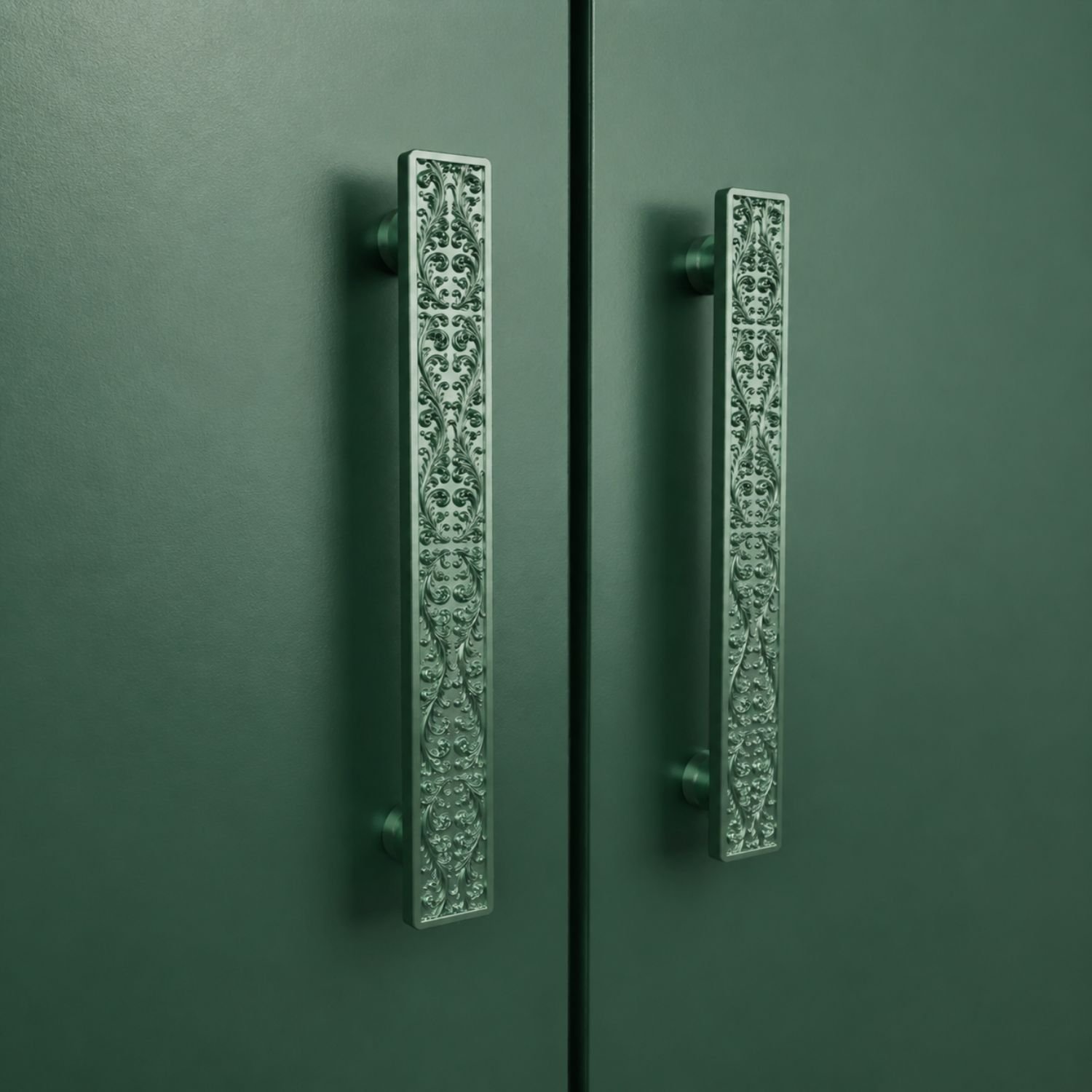
Light Emerald leans toward jewelry, a deep, luminous green that takes on an almost gem-like quality against a dark background. Dark Lilac, finally, is likely the most surprising of the lot: a purple that keeps the softness of lilac while owning it fully, best set against light wood for an almost poetic touch. In both cases, the same rule holds: a strong color needs room, it does not share the stage with another color just as bold.
Pattern or Solid Material: Two Ways to Carry Color
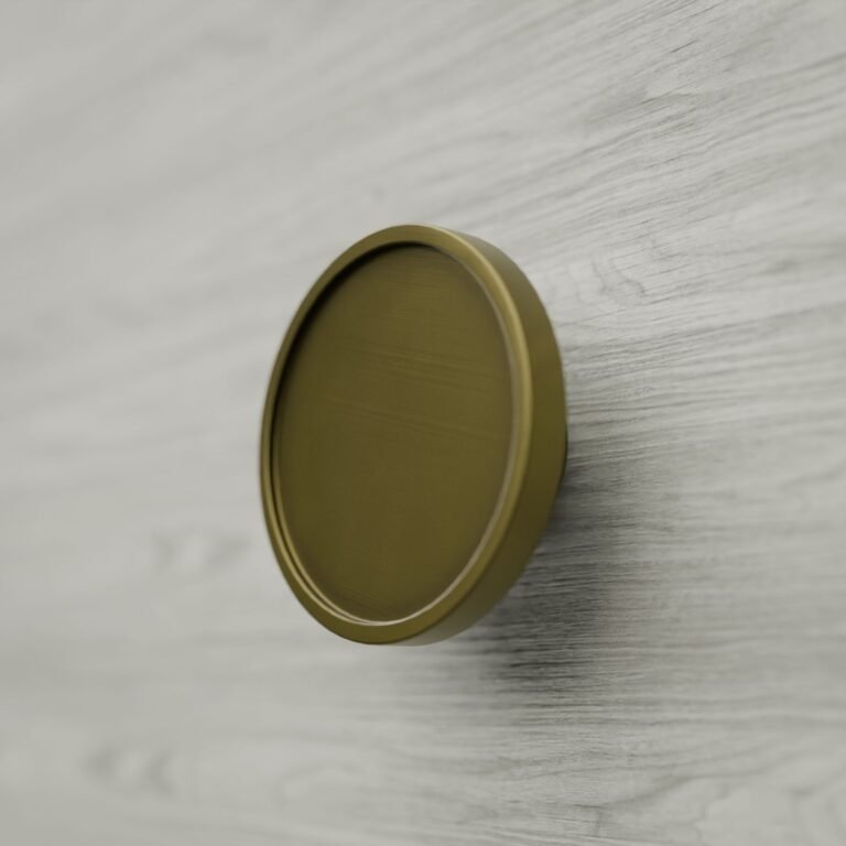
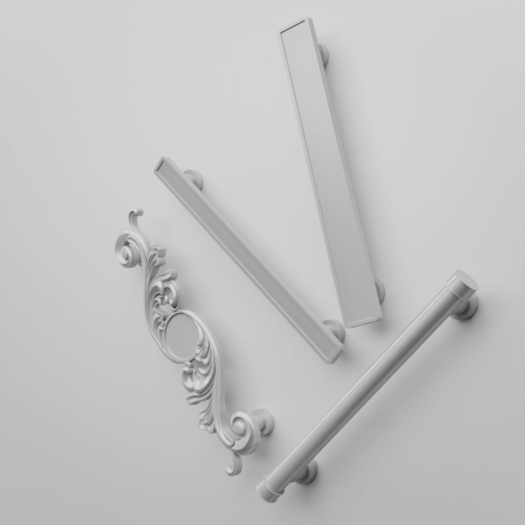
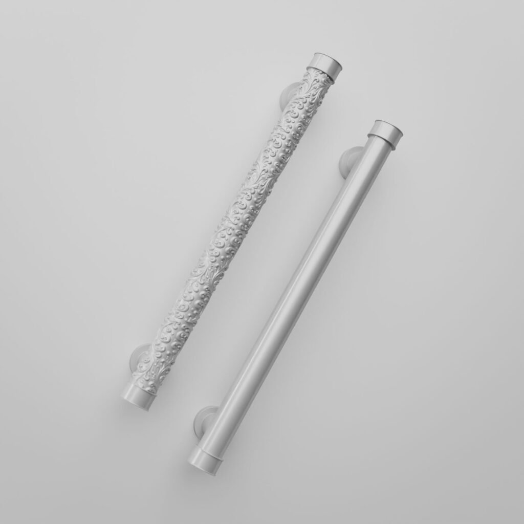
Most Essential silhouettes let color alone occupy the visual space: a bare cylindrical shaft like the Florentine Column, a clean-lined square like the Palazzo Square, a round knob like the Classica Round. Material and color are enough, with no further ornament.
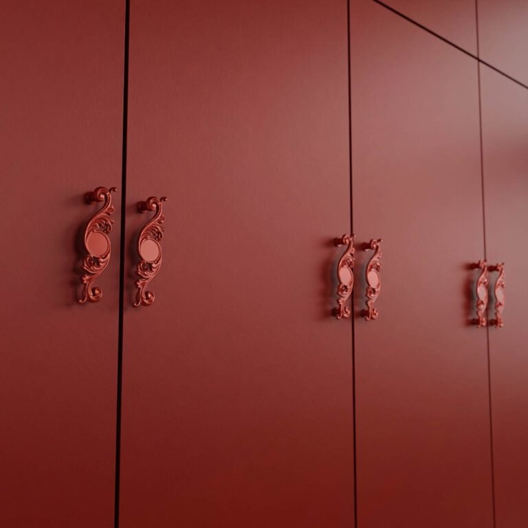
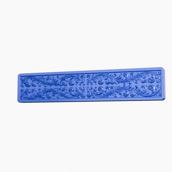
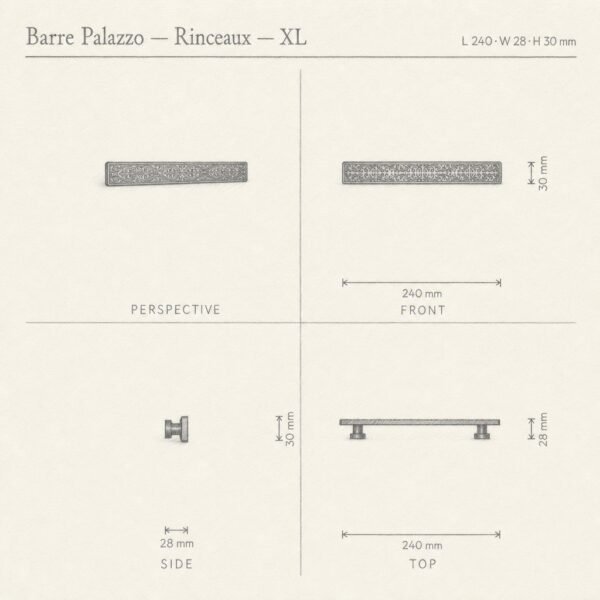
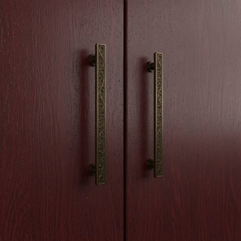
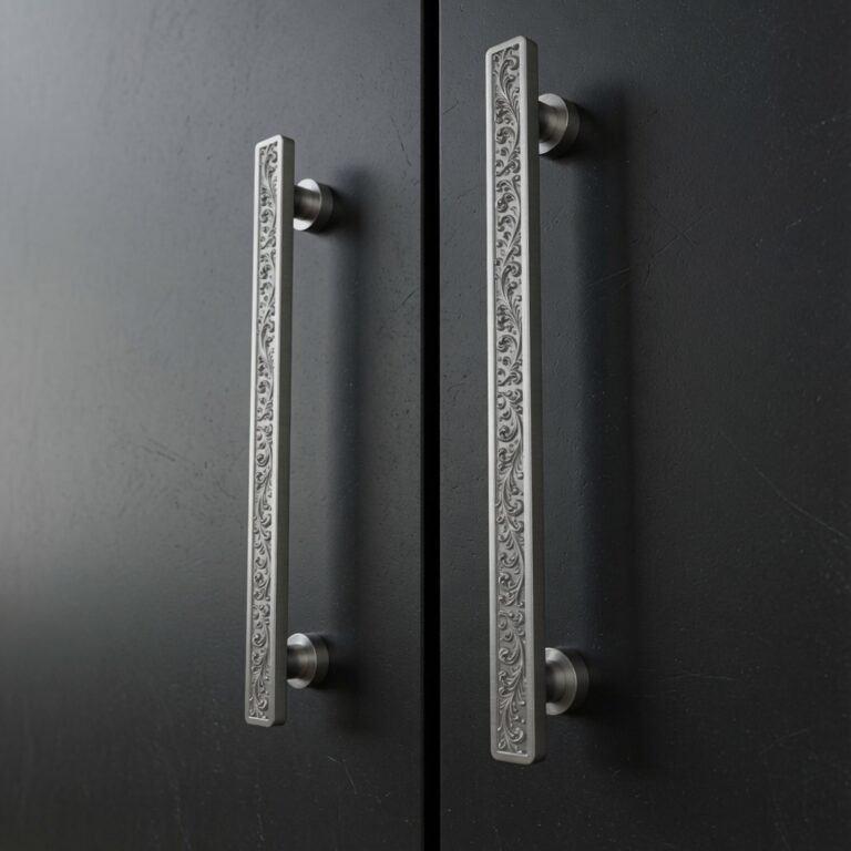
But bioresin is not reserved for plain silhouettes: Scrollwork, the oldest ornamental pattern in the Western decorative repertoire, translates just as well into this palette. On the Scrollwork Palazzo Bar, the volutes carve in and catch the light differently than a smooth shaft, a play of material that works just as well in blue as in emerald green. The choice between the two silhouettes is not just aesthetic: a bare line highlights the flat color and the pearled sheen, an ornamented line adds a relief that catches even more light.
What to know before you choose
- Recommended use: bedroom, closet, living room, dresser. Avoid: kitchen, bathroom, outdoors, heavy-use drawers.
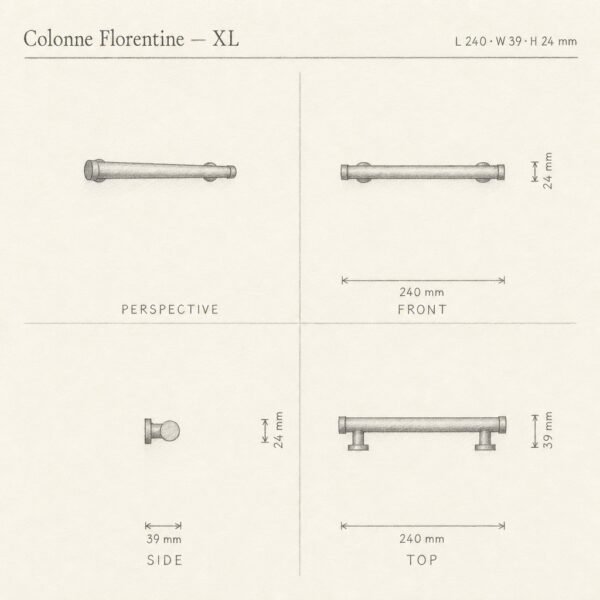
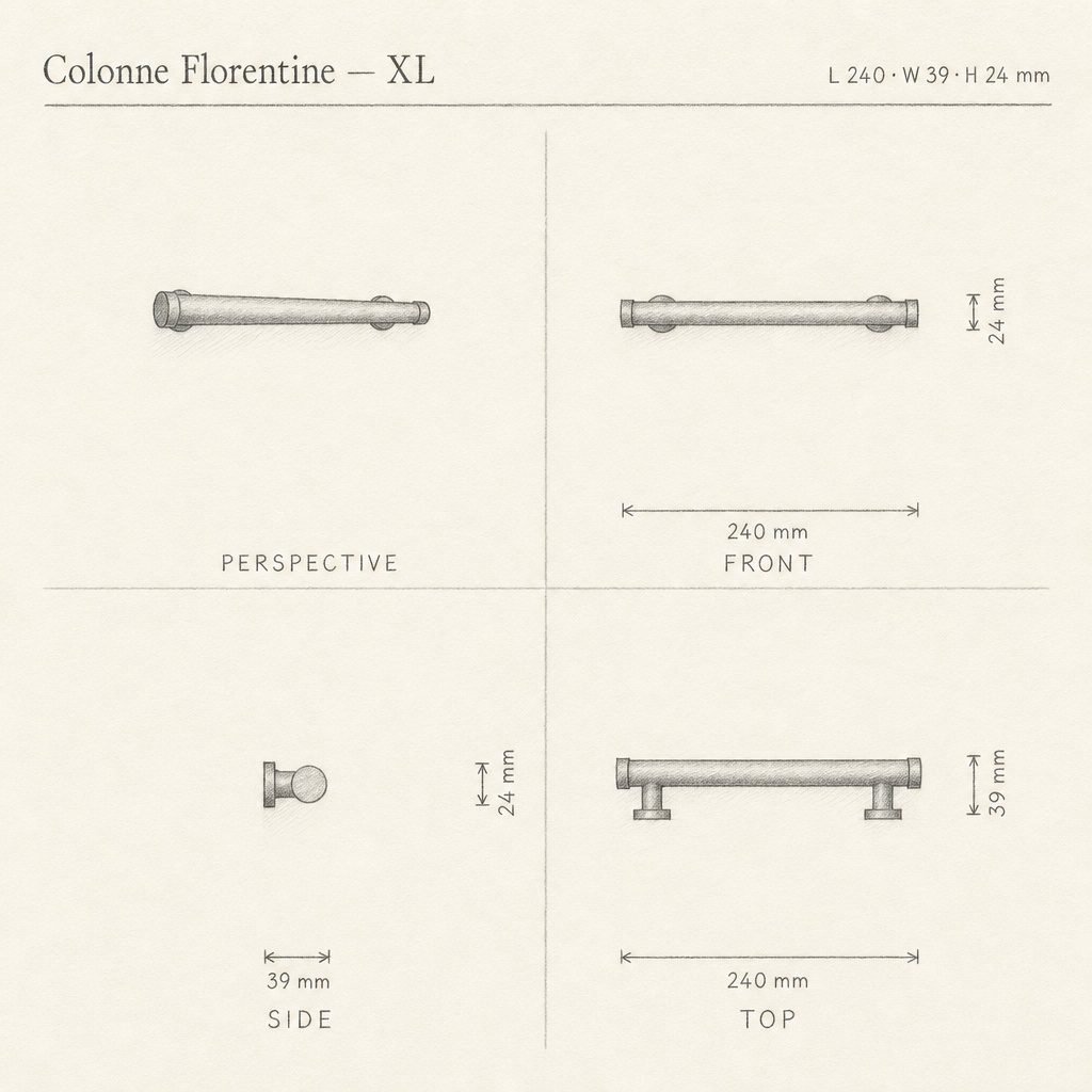
- Sizes and center-to-center spacing: the Florentine Column comes in four lengths, with center-to-center spacing from 96 to 192 mm depending on size, enough to cover a small drawer as well as a large front.
- Care: a soft cloth and soapy water are all you need. Avoid abrasive products, as the pearlescent surface is more delicate than brushed metal.
- Pairing: on a dark front, a bold color becomes a graphic accent; in a tone-on-tone match, it fades into the volume and lets only the pattern’s relief speak.

This same confident use of color already appeared in our article on dresser handles: one detail changes everything in a bedroom, even before touching the rest of the furniture. Conversely, for a more matte, patinated language, wabi-sabi metal tells a different, quieter story.
At Holdon Paris, bioresin isn’t conceived as a substitute for metal, but as a material in its own right, with its own vocabulary: color throughout, a pearlescent grain, a lightness that invites you to mix and match shades rather than commit to just one for life. It finds its place in rooms where detail is looked at, not just used. You can explore all the colors in the catalog or browse the full range of bioresin handles.
Practical questions
Are bioresin handles resistant to moisture?
No: bioresin isn’t recommended for humid rooms like the kitchen or bathroom, or for outdoor use. It finds its place in living spaces, bedroom, closet, or living room, where it’s seen and appreciated without facing the demands of heavy use.
What center-to-center spacings are available on the Florentine Column?
The Florentine Column comes in four sizes, from S to XL, with center-to-center spacings of 96, 128, 160, and 192 mm, to suit both a standard door or drawer front and a custom-made piece.
Can a colored resin handle be paired with a dark front?
Yes, several shades in the range work particularly well here: Candy Red takes on an almost lacquered accent against a matte black front, while Light Emerald reveals an almost jewel-like depth.
How do you care for a bioresin handle?
A soft cloth and soapy water are enough. Avoid abrasive products and repeated rubbing, as the material is more delicate than metal or lacquer.
Is there a more durable alternative in similar shades?
For a kitchen or bathroom, satin aluminum is the better choice, well suited to cool tones like silver gray, or bronze and brass for warm tones: the color takes on a different character, but the durability holds up.