Color, Spoken Softly or Shouted
Two ways to bring it home.
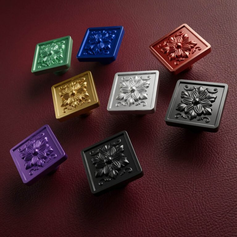
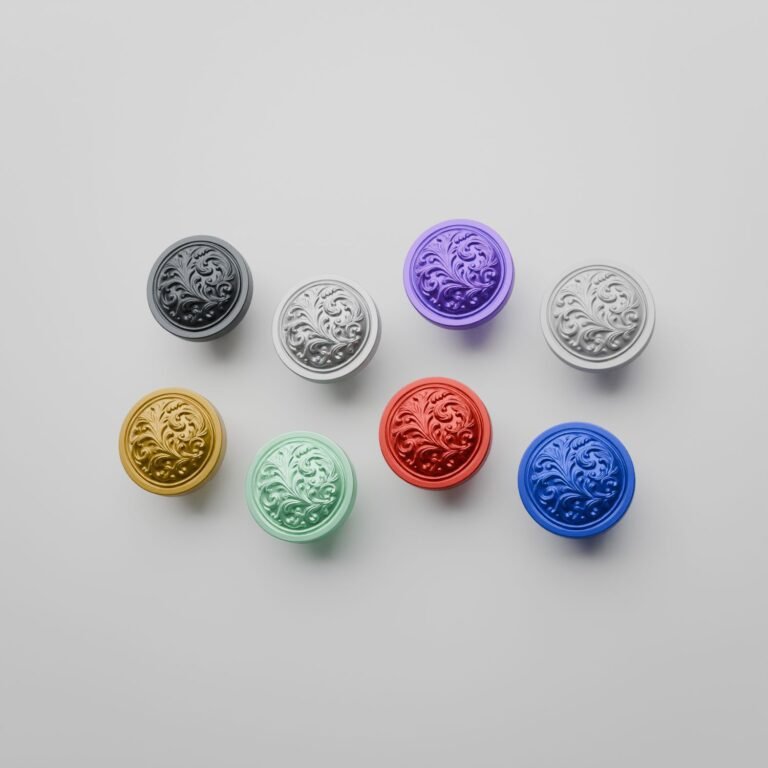
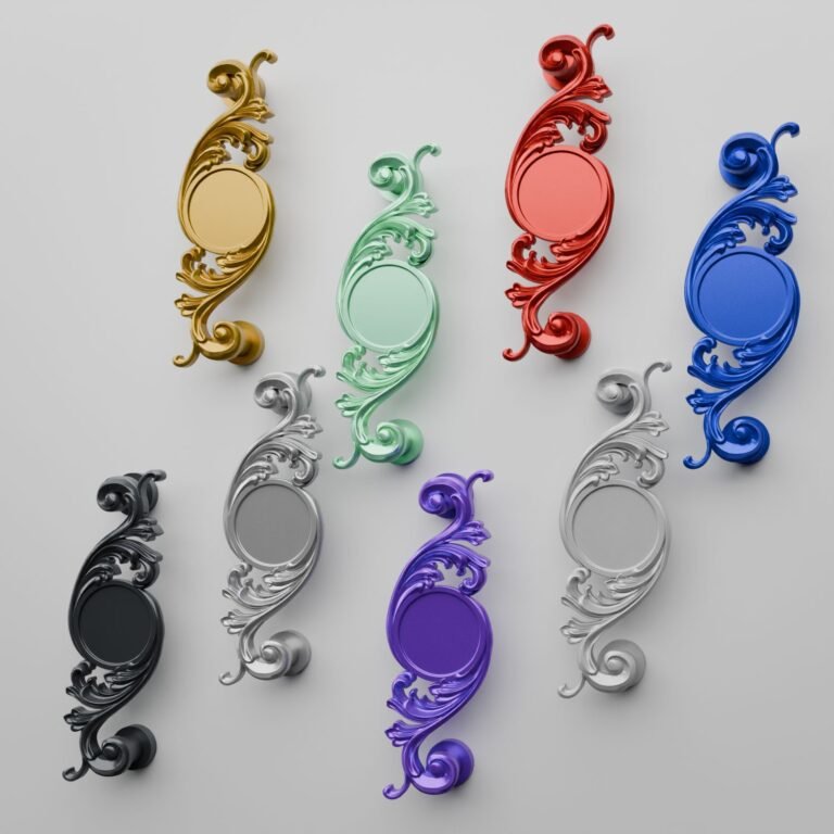
Metal has its own nuances: patinas, reflections, the depth of a bronze or the shine of a brass. Color opens an entirely different register. With our bioresin, the palette suddenly widens: an electric blue, an emerald green, a deep red, a snow white. But the real question isn’t which color to choose. It’s: how do you want it to behave?
Because a color can whisper or declare itself. It can blend into the front until it nearly disappears, or stand apart from it to the point of becoming the room’s first word. Between these two extremes, everything is a matter of intention, and that intention is decided before the shade, not after.
Color in a whisper: tone on tone
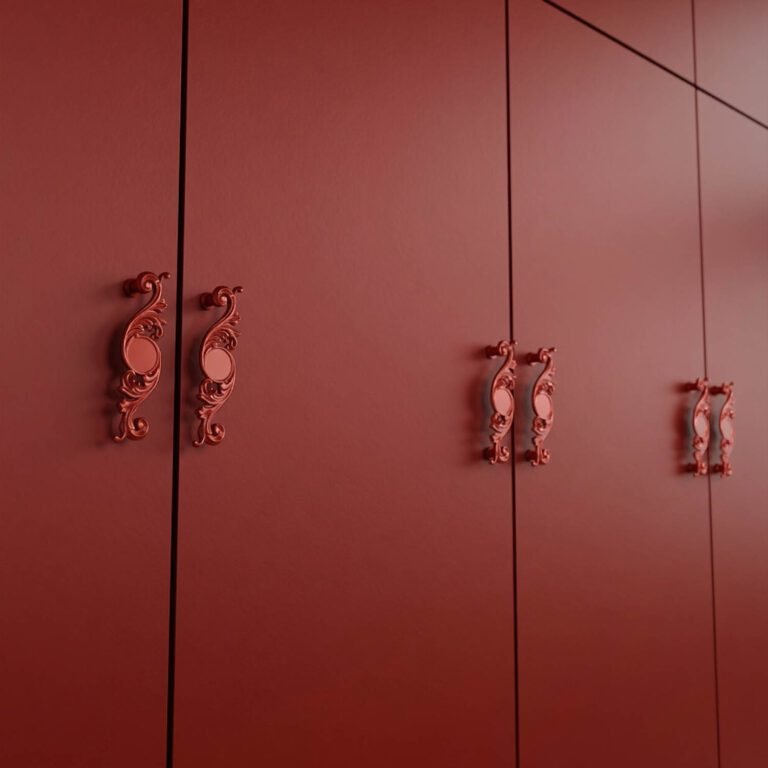
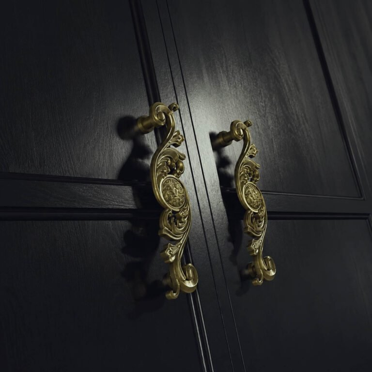
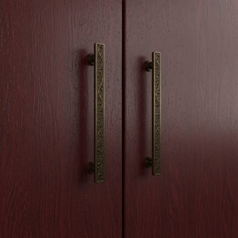
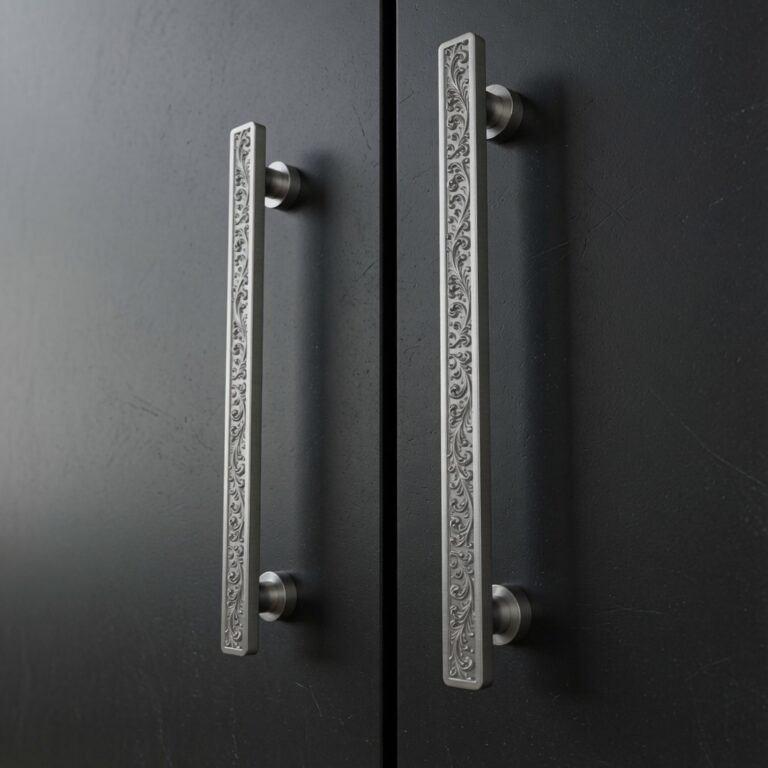
First way. The handle matches the front’s shade, or comes very close to it. It doesn’t shout, it refines. On a light front, a white or a silver gray plays up material and shape rather than color: what stands out then is the curve, the relief of the pattern, the way light glides across its surface.
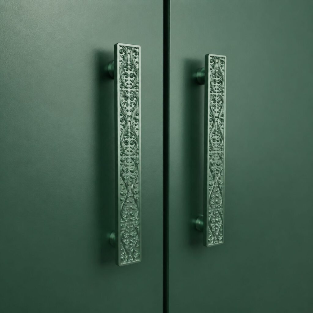
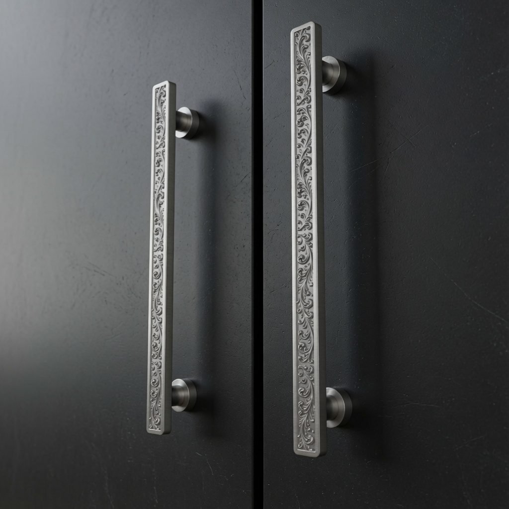
The result is calm, sophisticated, almost sculptural. It’s the choice of those who like a room to be looked at twice before you understand what makes it feel so right. Tone on tone excels when the front already has character, a strong color, a bold wood grain, or when the room is busy and you’re looking to calm it rather than add to it. The handle then stays discreet, and it’s the coherence of the whole that comes through.
Color out loud: contrast
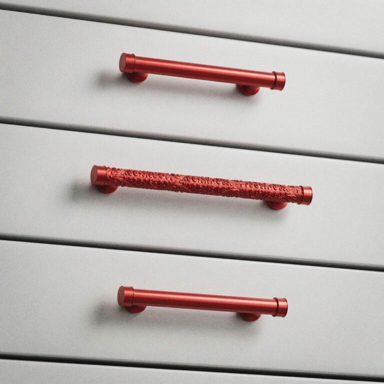
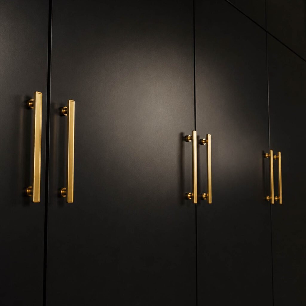
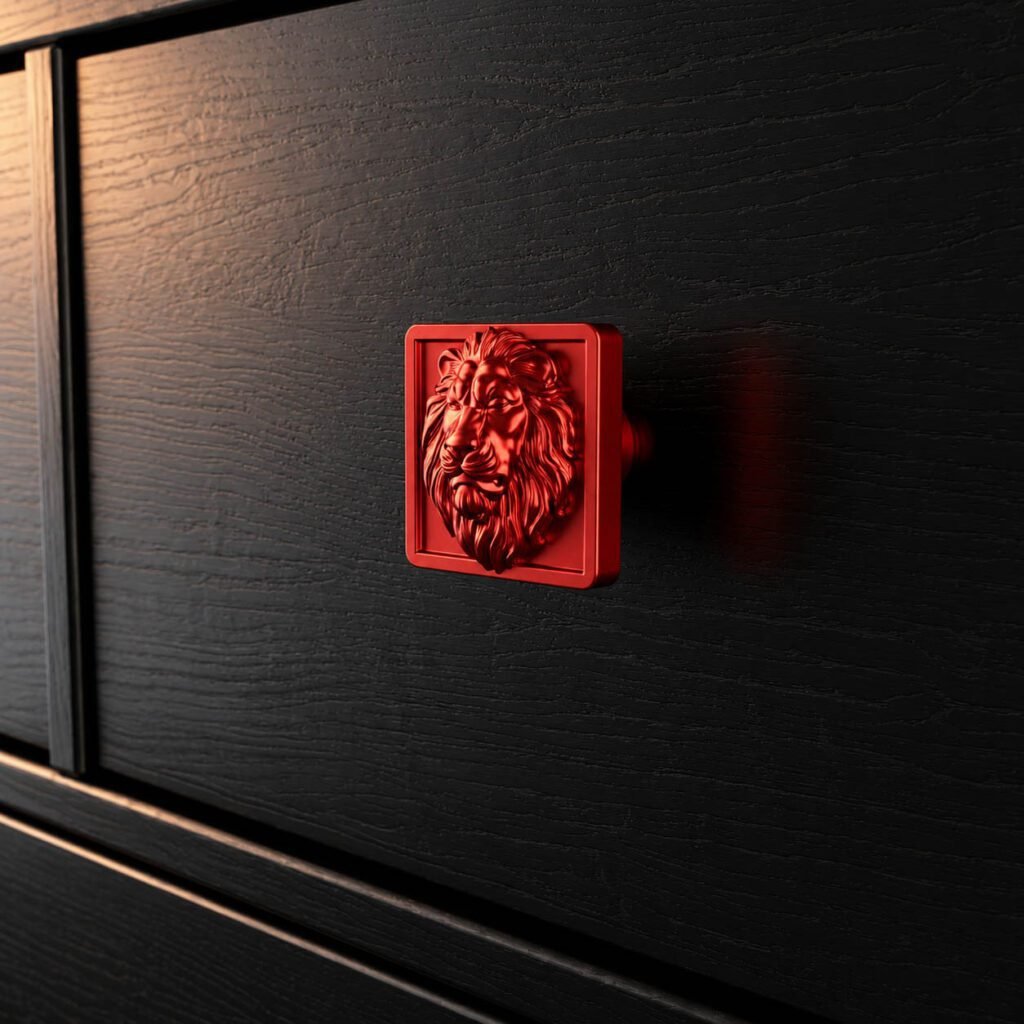
Second way. Here, the handle becomes punctuation. A candy red on a dark piece of furniture, a golden yellow on midnight blue, a purple on light wood. The handle stops being a detail and becomes the room’s jewel, the one that wakes up everything else and catches your eye the moment you walk in.
Contrast calls for a bit of boldness and one single rule: one strong gesture is enough. A bright shade repeated across an entire piece of furniture neutralizes itself, placed in one chosen spot, it pops. The safest approach is to pick an accent color, commit to it, and let the rest recede, exactly as you’d reserve a sculptural pattern for the doors that get seen. The effect doesn’t come from how much color you use, but from where you place it.
How to decide
Look at your front. If it’s already strong, tone on tone calms it and lets it reign. If it’s neutral, white, gray, light wood, contrast gives it a signature it doesn’t yet have. That’s the first instinct, and it’s often all it takes.
Three pointers to help refine your choice:
- The light in the room. A bold hue comes alive in beautiful daylight; in a dim room, it fades. A tone-on-tone pairing, though, holds up in any light.
- The number of handles. On a large kitchen, repeating a bold color quickly saturates the eye, a single accent works better. On a small piece of furniture, the contrast can afford to be generous.
- The other metals in the room. Faucets, light fixtures, hinges: a color is also chosen in harmony, or in sharp contrast, with what already surrounds it.
And nothing requires sticking to a single register throughout the house. Tone-on-tone in the bedroom, a bold accent in the entryway, an understated kitchen punctuated by a single touch: the palette lends itself to every shade of voice.
There’s no wrong answer, only the mood you’re after.